I have looked at the music charts for 2013 since I want to know what the most successful genre of 2013 was in the singles chart. Blurred lines, Get Lucky and Wake me up were the top three and two of the three artists are dance music producers (Daft Punk, AVICII) This indicates dance music is still going strong worldwide. The songs are both under the dance genre and give the genre a positive look as they are positive songs and very well known. Most of the songs in the top 15 would be played at parties and dance events which helps me support my genre of dance music and helps me know that when making my music magazine I have a big target audience.
Jacob Sanderson AS Work
Friday, 4 October 2013
Tuesday, 30 April 2013
My finished Cover/Contents/Doublepage spread!
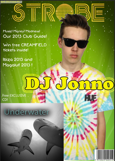
This is my finished front cover -

This is my finished contents page -

This is my finished Double-page spread -


This is my finished contents page -

This is my finished Double-page spread -

Sunday, 28 April 2013
Doublepage Spread Progress!
Here is the progress i have made with my double-page spread -

The first thing I did was create a new Photoshop document fitted to a double-page spread. I instantly added a pull quote to attract the audience and bring them in. I decided to put a white backing on the quote to make it a focal point of the page. This is similar to what mixmag do with their pull quotes.

I then added my main image, this was a medium shot of my artist. I used the background that was shot with the artist since i wanted to use the mise-en-scene of it, The lighting was adjusted so that it would be focused on Jonno and then the light would fade. I also had to resize the image to fit the double-page spread.

Finally i added my text which was relevant to the image, I kept a consistency of red and black through to show the audience who was talking in the interview section.
Thursday, 18 April 2013
Monday, 15 April 2013
My Images

Front Cover Image
I am using this picture as my main image. This is a medium shot of my artist with him staring into the camera, his glasses make you feel like you are you looking at him directly back. I have done this so it seems arrogant and he looks confident. His T-Shirt is colorful to represent summer and energy. I had him go for the cool, confident image to attract the audience with the colour and facial expression. I used a all white background but then decided i wanted the background to be a standout colour like yellow/green. I believe this image is perfect for my genre. I followed the conventions of other magazines were the artist is staring back at the audience making a direct link.

Double-Page Spread Image
This picture will be my main image on my double-page spread. I have made the artist cross his arms to act like he had secrets he doesn't want to reveal but the article inside will 'Reveal all' I have kept the bad boy look on him with this glasses covering his face and him looking away from the camera. I left the right side of the image open and free since i will be using this for my writing and keeping the left side just for the main image. The shadow behind him was used to relate to the article were i will be using things such as 'he has been in the shadow of his brothers fame'.
Friday, 15 March 2013
Subscribe to:
Comments (Atom)


