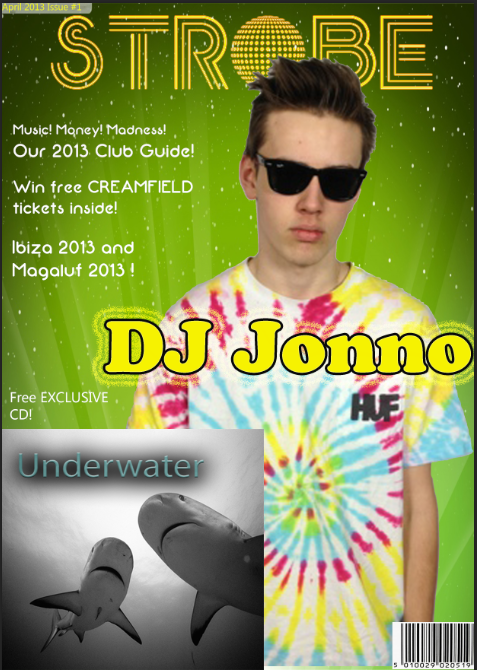
This is my finished front cover -
This is my finished contents page -
This is my finished Double-page spread -
Tuesday, 30 April 2013
Sunday, 28 April 2013
Doublepage Spread Progress!
Here is the progress i have made with my double-page spread -
The first thing I did was create a new Photoshop document fitted to a double-page spread. I instantly added a pull quote to attract the audience and bring them in. I decided to put a white backing on the quote to make it a focal point of the page. This is similar to what mixmag do with their pull quotes.
I then added my main image, this was a medium shot of my artist. I used the background that was shot with the artist since i wanted to use the mise-en-scene of it, The lighting was adjusted so that it would be focused on Jonno and then the light would fade. I also had to resize the image to fit the double-page spread.
Finally i added my text which was relevant to the image, I kept a consistency of red and black through to show the audience who was talking in the interview section.
Thursday, 18 April 2013
Monday, 15 April 2013
My Images
Front Cover Image
I am using this picture as my main image. This is a medium shot of my artist with him staring into the camera, his glasses make you feel like you are you looking at him directly back. I have done this so it seems arrogant and he looks confident. His T-Shirt is colorful to represent summer and energy. I had him go for the cool, confident image to attract the audience with the colour and facial expression. I used a all white background but then decided i wanted the background to be a standout colour like yellow/green. I believe this image is perfect for my genre. I followed the conventions of other magazines were the artist is staring back at the audience making a direct link.
Double-Page Spread Image
This picture will be my main image on my double-page spread. I have made the artist cross his arms to act like he had secrets he doesn't want to reveal but the article inside will 'Reveal all' I have kept the bad boy look on him with this glasses covering his face and him looking away from the camera. I left the right side of the image open and free since i will be using this for my writing and keeping the left side just for the main image. The shadow behind him was used to relate to the article were i will be using things such as 'he has been in the shadow of his brothers fame'.
Subscribe to:
Posts (Atom)