Thursday, 28 February 2013
My Concept!
The concept of my main artist is about a new and upcoming DJ called Jonno who has recently rose to fame with his brand new single 'underwater'. He is from Liverpool and has just reached the age of 18. My double page spread will be a interview with him and a short introduction about how he rose to stardom. My main image on my front cover is Jonno wearing a very colorful t-shirt looking cool and relaxed. This is get across his genre and the fact he is confident even though he is so young. My double page spread image is also Jonno looking relaxed and almost arrogant, again expressing his confidence and his clothing showing his energy. I have tried to be realistic with my images of Jonno and took ideas from how other DJ's pose and act for magazines. They all are looking into the camera with no expression. I have brought this into my own concept.
Wednesday, 27 February 2013
My page layouts!

I have placed the masthead at the top in the center since it is conventional and needs to been shown off since the masthead is important to attract the audience. I have covered some of the masthead with the main image since my idea is that the main image will be my source of attracting the audience due to the bright colours. My main image will be my unique selling point so why is why i want it to cover most of my front cover. I will be putting information about what is inside and sell lines across as once the audience notice these it will make them want to buy the magazine even more. I will have a bright coloured background and pink text to stand out. In the middle of the image I will their name/title, it will overlap my main image. In the bottom right hand corner I will put my barcode since this is necessary for magazines, Another idea i have took from my research is to use sell lines, i will use at least 3 in my front cover, one of these being a free CD i will incorporate into the magazine. I have decided to name my magazine 'Strobe'.
 The main image that I will use will be on the left page since this is conventional and leaves alot of space for my article. I will have the main headline/Quote on the top of the right side to introduce my artist, The other image i have will be placed under my text and will be relevant to what the text is talking about. My double page spread will be simplistic, i took this idea from analyzing other magazines. The text will be in columns and go across the bottom half of the pages in three separate columns.The reason i used a pull quote is to engage the audience with a interesting fact relevant to the artist. The text will be simple and black reflecting on a white background. I will also have advert for my artists new single.
The title of the contents will be in the top left hand corner, since its conventional and it is were most people begin to read from.The biggest image will be under the listing of page information and will be relevant to it, i have made it so the text is more important than my main image, the image is just to help give the page some life. I will be keeping my contents page very simple with it just getting straight to the point, i will have a simple design on the right-hand side. There will also be a competition advertisement in the top left hand corner of the page, this is to attract the audience in more since people like to look at the contents page before buying the magazine. I have chosen a simple design since i believe they are more attractive to the eye and people don't want to be bombarded with information and pictures while looking at the contents page since it is for information alone.
Tuesday, 26 February 2013
Magazine covers!
Magazine Covers
Kerrang has a very busy layout and has alot going on. You are instantly attracted to the main headline 'Bring me the horizon' This is because the white makes it eye catching while the text is bold and in capitals. This is done in a way that the headline is shouting at you, this relates to the band since there genre is 'Screamo'. The main image covers the title and the top half of the cover, it shows they are significant enough to take over the cover. The main band member Oli Sykes stands out in the front of the magazine showing dominance while his band-mates are faded into the background. Black, Red and White are the main colours used since they all stand out well, the main image also follows this consistency. The masthead is covered by the main image, this does not matter since the magazine is so well known they don't need it to be shown. There are images of 3 other bands below the main image and attract the audience to them and not just the main image, this makes all of the bands significant. The aim of this front cover was to draw our attention to the bands and this is done well. Kerrang offers a 'poster special week' which is a sell line to increase peoples interest in buying this magazine.

This magazine cover is very simple and works well. A reason why this cover works well is since only 4 colours are used in total, the colours used stand out and complement each other well. Adele is the main image and the only image, it is a close up shot of her face. This is a good main image since Adele is a great role model and inspiration for others and will attract people due to her being on the front cover and improving the reputation of the magazine. The headline contains a quote of Adele this is usually used on a double page spread not a front cover but is common on both. The rest of the front cover is short and simple, it alerts the reader of what else they can find inside with large bold text, but they have obviously focused on Adele. The masthead is sat in the left hand corner away from text. The masthead is important for the audience to see since Q is a well known music magazine and once the audience sees this they will be engaged on the magazine. It is a very simple design and at the bottom of the page it is highlighting the fact that it's based on Adele

Our attention is instantly on the main image since it takes up the front cover, we know this is important at it covers most of the masthead but this is a common house style by rolling stone magazine. The main image is also captioned by the artist's name which is in the same colour as the mast head to show which part of the front cover it the most important and significant. The layout is simple and looks nice on the eye, Things overlap but we don't really notice it since the colours stand out. The other text is in a column, it is out of the way and does not stand out. The text promoting the other artists inside is organized and positioned in its own space, it is maturely laid out, the difference between this and Kerrang is the fact that rolling stone uses its space well while Kerrang crowds you with alot of information at once which is not appealing at all.
I will be taking alot of ideas from rolling stone as it is very well made and is what i would like my magazine to look like.
 Lastly i have chosen to analyze and take ideas from this mixmag cover since it shares my chosen genre of dance music. This cover follows mixmag's usual house style, the main image is a shot of one artist and they have their common strap line above the masthead. They also keep the consistent colour scheme of pink and white. They use the pink, white and yellow since they are proven to be the most eye catching colours, this will stand out against other competitors. The main image is very dominant and the cover uses mode-of-address too attract and appeal to the reader. The fonts around the cover are all different this shows variation but the masthead and headline have a curly and funky font, this is very youthful and shows their target audience will be younger adults and even teenagers. The simplistic feature of the cover draws in the audience and even reflects the audience, the readers don't want to be bombarded with information but want to be took straight to the point. Mixmag contains at least 3 sell lines, they offer alot if you buy the magazine. It seems desperate but it works. A good convention that i will be using is the rule of three since it sticks in the audience's mind, mixmag have used this a few times such as 'Berlin to Brazil'
Out of all four of the covers i have analysed this is my favorite. This is what i will be taking inspiration from the most.
Tuesday, 12 February 2013
Double page spread analysis
A double page spread should contain a consistent pattern but also a original house style. A quote from a interview or new album is usually presented as the headline, they are controversial to grip the attention of the reader. Another code and convention is that the celebrities or group name is in bold. Text on a double page spread has to be size 11pt it is set into columns to keep it tidy and neat. The main picture is always on the left, but some magazine go against this codes and conventions and do not.
This is my analysis of a double-page spread

This is my analysis of a double-page spread

Saturday, 9 February 2013
What expect on a double page spread!
Topics -
- Interviews
- Upcoming events
- Reunions
- Q&A's
- Reviews
- Latest News
Style -
- House style, Suited to that magazine
- Style co-ordinates to the artist
- Colour Schemes
- Typical codes and conventions eg, Large image on the left/Quote
Layout -
- Design fitted to that magazine's house style
- Easy to read
- Pictures that relate
- Different fonts and sizes
- Large main image covering one side of the double page spread
- Quotes and headlines
Thursday, 7 February 2013
Content page analysis
Content page analysis
The content page i am analyzing is from mixmag it spreads across both pages, its a double spread contents. The contents page following a black and white coloured theme with the text all white and the background being black, this is due to a black background making white writing stand out, it also makes it look professional. The contents page follows a conventional style that other magazines do, it has the pages listed to the sides with images in the middle promoting some of the articles inside. Everything in the page is spread out nicely following mixmag's house style of a relaxed and simple layout and colours.
Although their are other images that welcome to reader to carry on reading the magazine the main image is the most attractive and eye catching, it is of two young attractive girls having fun, this is for young people to interact with and relate to since they want to be doing the same, this will want the younger audience to check were this is is and how they can be doing the same. Mixmag use a double-page spread for their contents, this is their own house style since not many other big magazine's use this feature. This contents page keeps a consistent balance of pictures and text.
I am now comparing this to a college magazine -
 This college magazine draws your attention instantly to the 'Contents' title since it has a white background with black text, this is quite unprofessional as it's not creative and could use better colors. The white text on the black background makes it really easy to read but hurts the eyes after a while of reading which is a bad trait and not good for the reader,the pictures used are pictures of the college and two people sitting around, the pictures are simple but not effective they do not give you the feel that you want to be there. They have used 4 pictures in total which takes up nearly three quarters of the contents page. I find this annoying as the contents page is for information not for the college to be shown off. Furthermore, the text on the contents page looks like bullet points and a list which is not what i would like my magazine to look like, This contents page lacks allot of creativity and
effort to look good. I will not take insperation from this but i now know how to make my contents page appeal to others.
The content page i am analyzing is from mixmag it spreads across both pages, its a double spread contents. The contents page following a black and white coloured theme with the text all white and the background being black, this is due to a black background making white writing stand out, it also makes it look professional. The contents page follows a conventional style that other magazines do, it has the pages listed to the sides with images in the middle promoting some of the articles inside. Everything in the page is spread out nicely following mixmag's house style of a relaxed and simple layout and colours.
Although their are other images that welcome to reader to carry on reading the magazine the main image is the most attractive and eye catching, it is of two young attractive girls having fun, this is for young people to interact with and relate to since they want to be doing the same, this will want the younger audience to check were this is is and how they can be doing the same. Mixmag use a double-page spread for their contents, this is their own house style since not many other big magazine's use this feature. This contents page keeps a consistent balance of pictures and text.
I am now comparing this to a college magazine -
 This college magazine draws your attention instantly to the 'Contents' title since it has a white background with black text, this is quite unprofessional as it's not creative and could use better colors. The white text on the black background makes it really easy to read but hurts the eyes after a while of reading which is a bad trait and not good for the reader,the pictures used are pictures of the college and two people sitting around, the pictures are simple but not effective they do not give you the feel that you want to be there. They have used 4 pictures in total which takes up nearly three quarters of the contents page. I find this annoying as the contents page is for information not for the college to be shown off. Furthermore, the text on the contents page looks like bullet points and a list which is not what i would like my magazine to look like, This contents page lacks allot of creativity and
 effort to look good. I will not take insperation from this but i now know how to make my contents page appeal to others.
Wednesday, 6 February 2013
Tuesday, 5 February 2013
Images for my college magazine
These are the images i took for a potential college magazine cover.

This image is a low angle shot of a student hard at work, This would be very suitable for my magazine, i have decided to use this as my cover since it represents what the magazine will be showing which is a hard working college. The lighting in this picture is also great.

This image is of a student contemplating the outside, it is a medium shot showing his uniform and the outside view, i dont think this picture is linked enough with the ideology of my magazine to be used.

This image is a low angle shot of a student hard at work, This would be very suitable for my magazine, i have decided to use this as my cover since it represents what the magazine will be showing which is a hard working college. The lighting in this picture is also great.

This image is of a student contemplating the outside, it is a medium shot showing his uniform and the outside view, i dont think this picture is linked enough with the ideology of my magazine to be used.
Friday, 1 February 2013
Using photoshop
We then replaced our own background with
another to make sure we understood fully
what we had done and doing. -

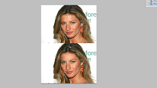
Our next job was to remove spots from a
supermodels forehead, We done this by using
the healing tool, we took skin from a healthy
place and used to on her spot to clear it
up, This is the before and after -

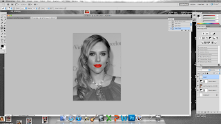
Finally we changed celebrity to black
and white while her lips remained red. To do
this we used the box tool to highlight the lips
and put them onto a new layer, then changed the
original image to black and white and finally
putting the red lips on top of the original picture
via layers -
another to make sure we understood fully
what we had done and doing. -

Our next job was to remove spots from a
supermodels forehead, We done this by using
the healing tool, we took skin from a healthy
place and used to on her spot to clear it
up, This is the before and after -

Finally we changed celebrity to black
and white while her lips remained red. To do
this we used the box tool to highlight the lips
and put them onto a new layer, then changed the
original image to black and white and finally
putting the red lips on top of the original picture
via layers -
Using photoshop

This lesson we were showed how to remove and replace a background on photoshop, we manipulated the photos. Firstly we opened photoshop -

We went to file and place after making a new canvas, after placing the image we resized it and pressed enter and then rasterized the image -

We now had to remove to background from the
image, to do this we used the magic wand tool
clicked the background and deleted and then placed a background onto the image of our chosen photo and replaced it with the background we had deleted -
Subscribe to:
Comments (Atom)


